Want to master the art of buttons designing for website and apps? We have done that research for you to design buttons for better user experience. Here are the most common mistakes that designers do.
Mistake No.1
Design Buttons that do not look clickable
When It comes to interacting with user interface, users need to know instantly what is ‘clickable’ of what’s not. Generally, the more time needed for users to decode the UI (user interaction) the less it becomes for them.
Users understand whether a certain element is interactive using their previous experience and visual signifiers to clarify the meaning of the UI object.
That’s why it so important to use appropriate visual signifies (such as size, shape, color, shadow, etc) to make the element look like a button.
Mistake No.2
Make Buttons too small for mobile users
In many mobile apps, buttons are too small. This often leads to the situation when users mistype. An MIT Touch Lab Study found that averages for finger pads are between 10-14 mm and fingertips are 8-10 mm. This makes 10 mm x 10 mm a good minimum touch target size.
Mistake No.3
Make the primary action button look secondary
The primary action on a page needs to carry a stronger visual weight and have a distinct contrast from its surroundings. It should be the visually dominant button. For instance, adding one colour to a grayscale UI draws the eye simply and effectively.
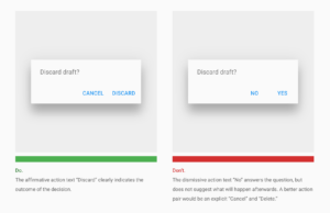
Secondary actions (like ‘Cancel’ or ‘Go Back’) should have the weakest visual attraction because reducing the visual prominence of secondary actions minimizes the risk for potential errors while further directing people towards a successful outcome.
Take Away
- Design buttons that look clickable by following a style that the user is familiar with. For example; use a filled button with square borders using the primary brand colour palette or accent colour.
- Make buttons accessible for mobile users, size matters!
- Make your primary call to action stand out.
- Use a stronger visual weight when designing primary action buttons, they should draw the user’s eye directing them towards a successful outcome.